QbD Design Space for Analytical Assay — Screening DOE [Tutorial]
I’m excited to share a Case Study on QbD Design Space for Analytical Assay — Screening DOE. Dr. HS Kim from Green Cross kindly shared his slides titled: “QbD using Design of Experiments Application for Analytical Assay.” The data of the experiment comes from Experimental Design in Biotechnology (Statistics: A Series of Textbooks and Monographs).
Since the full context of the experiment is not available, I will comment mainly on the overall DOE approach.
In this article, we will cover:
- Why Analytical Assay needs to apply DOE (Design of Experiments)
- Why Analytical Assay needs to consider noise
- A step-by-step JMP tutorial on how to run a Screening DOE
- How to interpret the results and graphs in a practical way
- A Tool for experiment projects that communicates your data analysis in just 3 minute
The Case Study begins in the middle, so if you want skip to it, scroll down.
First, Let’s Cover the Definitions:
What is an Assay?
It’s a measurement system – like a ruler or a scale.
“An assay is an investigative (analytic) procedure …”
1 The American Heritage Dictionary of the English Language. Fourth Edition. Houghton Mifflin Company: 2000.
2 McKean, Erin (ed.). The New Oxford American Dictionary. Second edition. Oxford University Press: 2005.
Assay is a Test Method
A test method is a definitive procedure that produces a test result.[1] The point here is: A test is part of an experiment.
A test can be considered a technical operation or procedure that consists of determination of one or more characteristics of a given product, process or service according to a specified procedure.[2] Often a test is part of an experiment.
1 Form and Style Manual, ASTM, http://www.astm.org/COMMIT/Blue_Book.pdf, 2009
2 ASTM E 1301, Standard Guide for Proficiency Testing by Interlaboratory Comparisons
The steps of an Assay consist of:
- Sample processing/manipulation
- Target specific DISCRIMINATION/IDENTIFICATION
- Signal (or target) AMPLIFICATION System
- Signal DETECTION (and interpretation) system
- Signal enhancement and noise filtering
In every step of the assay, there exists chance for variation or noise to influence our data. So let’s put the Assay Process into our Experiment framework.
So What is an Experiment?
An experiment is figuring out the relationship between the Input and Output – in the face of Noise. Watch this short and helpful Video.
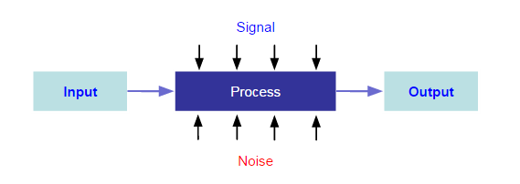
I emphasize NOISE because most scientist (including myself) make wrong conclusions from noise. The sad part is that many folks who perform DOE are not aware of noise and also do not know how to deal with it.
Here are some techniques to manage noise in design of experiments.
- Randomization
- Repeats
- Replicates
- Confounding
The following case studies did not use the noise techniques. So in a future post, I’ll share a tutorial on how to use them. I do like how HS emphasized the Signal versus Noise aspect. How this translates to an actionable item, I’ll cover separately.
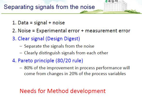
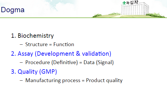
HS makes a point and even calls it a “Dogma”: Assay = Signal + Noise.
More Philosophy on Approaches of experimentation, beginning from Screening DOE, then Optimization to Confirmation.
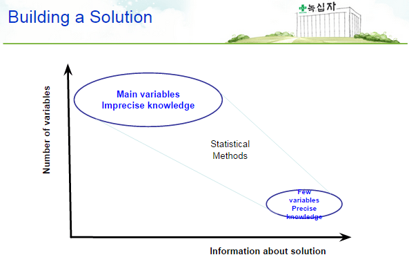
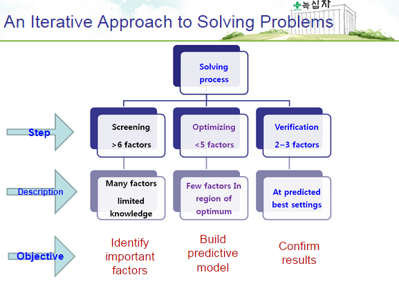
The slides are self-explanatory. HS is advocating the Iterative Approach of finding Design Space.
He uses the 3 steps: Screening – Optimizing – Confirmation, which we’ll follow, first with Screening.
Let’s now go to the Case Study:
In-Vitro Production of Monoclonal Antibodies

The Process:
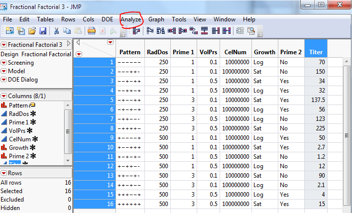
The Fishbone Diagram below shows:
the process (Radiation, Prime 1, Prime 2), the associated factors (Dose, Mice Age; Volume, Cell Number, Growth) and the Output (Antibody Titer).
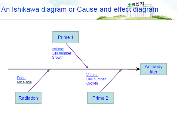
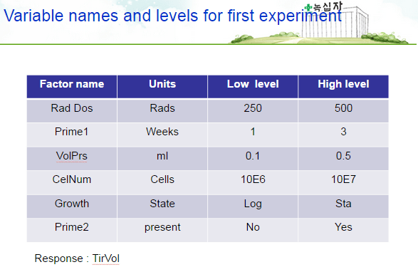
Below are the Variables or X’s (Radiation Dosage, Prime 1 Duration, Volume, Cell Number, Growth state, Prime 2) and their levels or ranges.
- RadDos : Dosage level of immunosuppressive Radiation (250 or 500 Rad)
- Prime 1 : Timing of injection
- VolPrs : Volume of Pristane oil
- CelNum : The number of Cell injected
- Growth : the Growth state of the cells
- Prime 2 : the second injection of Pristane oil
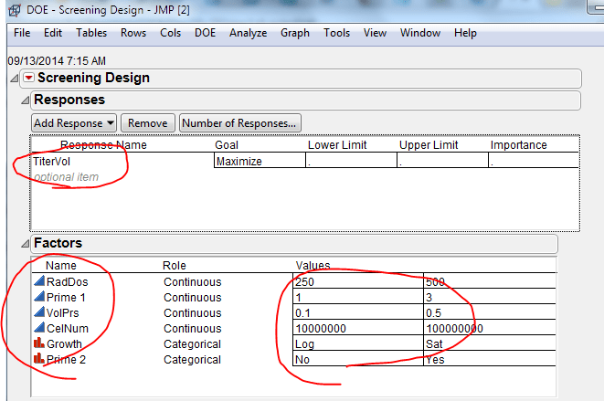
Titer Yield measured in Volume is the Output or Y.
- TtrVol : The antibody titer adjusted for volume
I tried to rerun the analysis myself so here are the screenshots so that you can follow along.
Below is the data table. It seems like a typical 6 factors, Resolution IV (4) Screening Design.

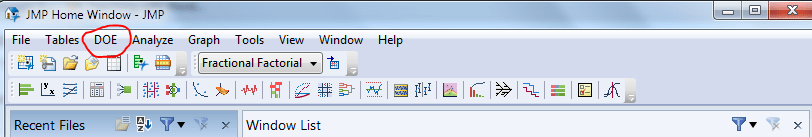
So I run a Screening DOE using JMP.
Next, put in the appropriate text and ranges for each variable. Check the Y and the X’s. X’s should’ve be in there automatically.
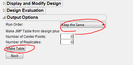
Then I click Make Table.
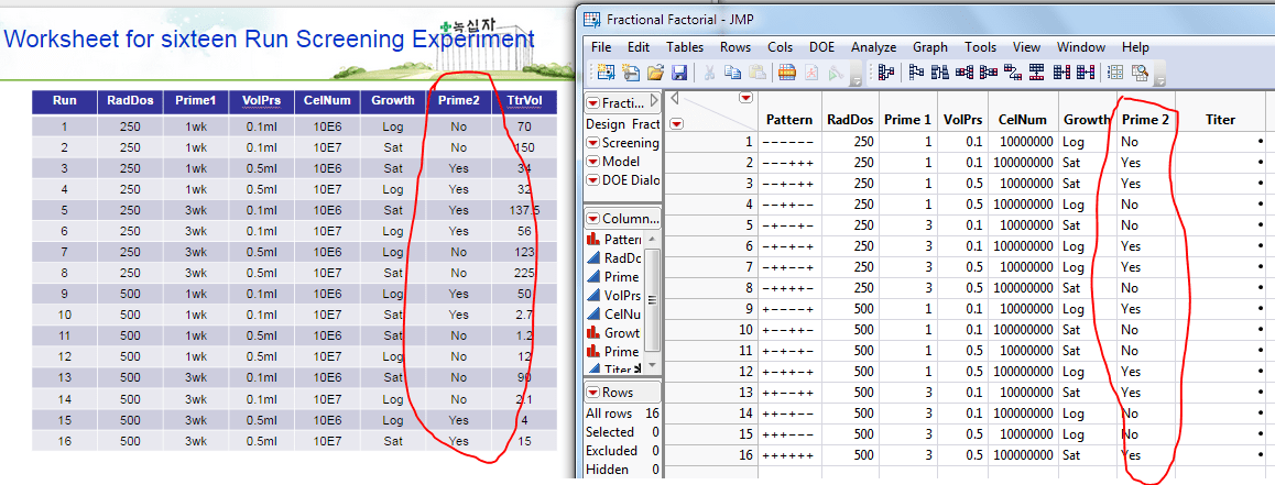
Then comes a surprise. When I ran the default 6 factors, Resolution IV (4) Screening Design, the default matrix comes out like this:
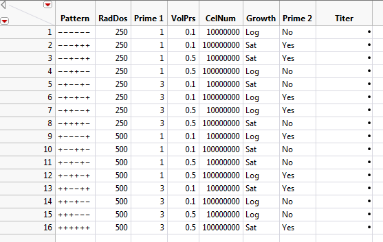
How’s it different from the original table? Take a look at the last row sequence – Prime2. Yes and No order is different. What do you think this means?
You may skip the following step but I’ll explain further for the detail-oriented folks.
It means the Alias structure is different. What does this mean? I’ll save this concept for another post.
In order to match the original data table, you have to change the matrix by changing the alias structure. Click on “Change Generating Rules” and change where the check boxes are checked.
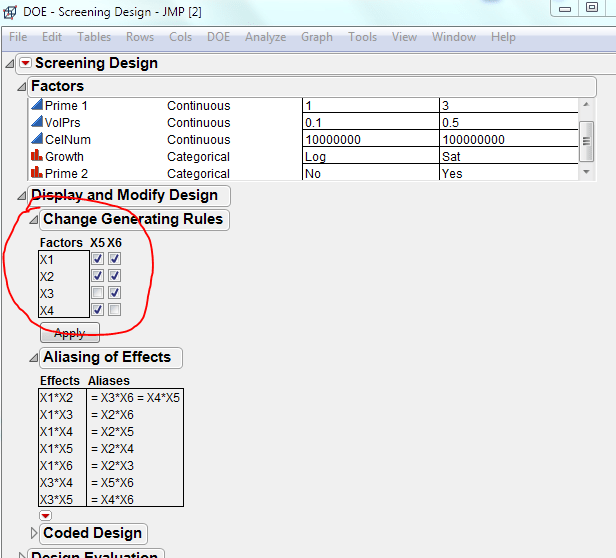
Then you should be set. Go ahead and check that they match.

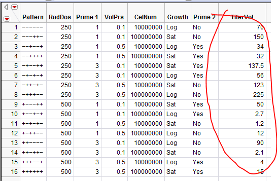
Now Just copy and paste the original data to JMP table.

Copy the above table and paste it into the table below.
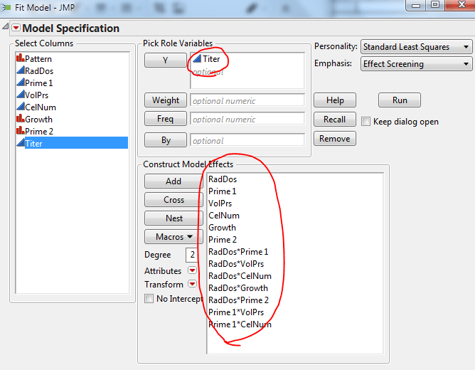
Now Click “Analyze”
In the drop menu, you should see “Fit Model.” Click it.
Now you should see the Model constructed as below.
Screening DOE Analysis
First, let’s look at how the data fits the model.
Summary of Fit:
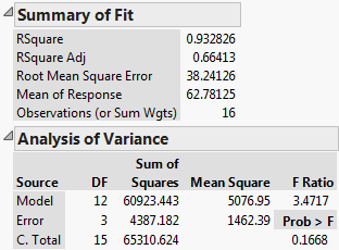
Looks like it’s an acceptable fit, although we could improve the efficiency of the model. . In general, the higher (max is 1) the R square and R square adjusted, the better the data fit the model. So the rule is if these 2 numbers are close to 1, it’s a good model. If the R square and R square Adjusted are close, then better. (Look for a future post on what this means and how to implement this technique.)
Sorted Parameter Estimates
Now let’s look at the effects of each process parameters or X’s. Below is a list of parameters ranked in the order of how much they affect the Titer Yield or Y. As you can see RadDos is the highest and then Prime 2, Growth, Prime 1 and so on.
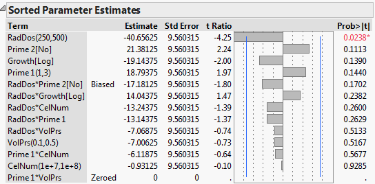
The blue vertical line shows where the statistical significance ends. If the parameter is outside the blue line then it’s significant. If it’s within the blue lines, then it may be just noise. You have to remember that this is just statistical significance and not necessarily “practical” significance and I emphasize the latter. So it’s up to you, the scientist, to decide whether this is a signal or noise.
The direction of the bar shows whether the parameter had a positive or a negative effect on the Y or the Titer Yield. For example, the higher the Radiation Dosage, the less the Titer Volume. You can change the direction of the effect easily by swapping the Low (250) and the High (500) settings.
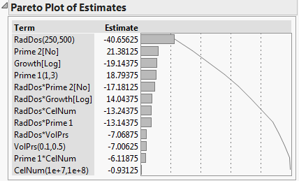
Pareto Plot of Estimates
If you want to simplify the visuals, you can just use the Pareto Plot below. It’s an absolute value of the effect that all the parameters (X’s) have on the Ouput / Titer Volume / Y.
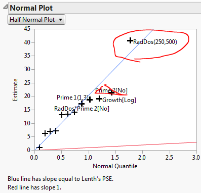
How to read a Normal Plot (& Half-Normal Plot)
Below are normal and half-normal probability plots (also more on this in a future post).
It’s another way of looking at the data. It tells you whether or not a data set is normally distributed or not.
Visualize a normal bell curve (Red curve) rotated 90 degrees clockwise. The parameters in the center of the bell are likely to be from random noise. The parameters placed at the tails of the curve could be outliers or non-normal parameters. These outlier parameters have significant effects.
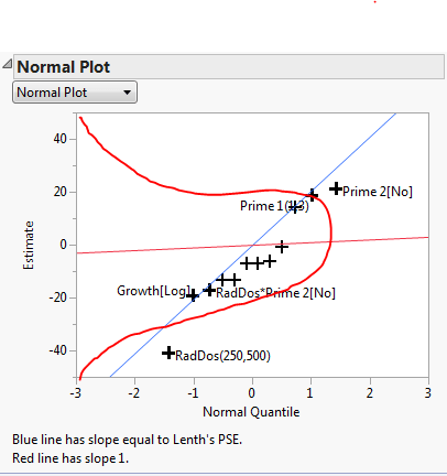
So how do we interpret this graph? Simply put, if a parameter jumps out of the blue line (Lenth’s Pseudo Standard Error) then that parameter has a significant effect (hence, not normal). The further from the line the higher the effect.
As you can see, RadDos and Prime2 parameters stand out. This conclusion is consistent with the conclusion derived from the Pareto Estimates mentioned above.

Some folks prefer the Half-normal plot, which gives same results, just visualized in a different way.
I prefer to use the Pareto Plot of Estimates just because most folks will understand it without explanation.
Conclusion from the Screening DOE
Now we arrive at the conclusion from the screening study.
RadDos was the main factor. Others were not so significant.
Do we stop here? Of course not.
In the next post, we’ll look at how the scientist took the next step of further optimization.
Let’s summarize what we just did.
1. We first started by stating the goal of the study – Increase the Titer Yield
2. We then stated the hypotheses. – 6 parameters increase or decrease the Titer Yield.
3. We then selected range of the 6 parameters
4. We chose the design of the screening DOE – 6 factors Resolution IV with 16 runs
5. Run the analysis – We reviewed Summary of Fit and ran Fit Least Squares calculation
6. Interpret the graphs – We looked at Parameter Estimates and Normal Plots.
7. Draw a conclusion – Radiation Dosages was the dominant factor.
8. Plan the next step – Further optimization.
Bonus: How to Share Experiment Results in a Technical Meeting?
To share all of this work, it will take an hour of power point presentation meeting. By now you know that I have an allergic reaction to unnecessarily long meetings. So I had to solve this problem for myself and other colleagues.
Now we can Communicate your Experiment Results in only 3 minutes
Here’s how I summarized the above experiment in a easy-to-read format.
No more Powerpoint slides in a dark room. Just print out your Experiment Canvas on a 11×17 or an A3 sized paper and bring it to the meeting.
Colleagues will thank you. You will have time for deeper discussions.
Make your own Experiment Canvas.
Do you have a QbD case study that you’d like to share? Then You need to get in touch me.